Saturday, July 27, 2013

Obsessed with Colours

Brocante in the Barossa's Colour Wall Display
Blog posts here have become few and far between, but only because we are still so busy with Brocante in the Barossa at the moment.   As might be expected of a new venture.  For more info, check us out at www.brocante-in-the-barossa.com and there are links at top right of the home page to also link to our Facebook and Pinterest pages.

As the business itself and its infrastructure are getting set up, I am turning my thoughts to creative directions.  So a few little forays into some musings here.  

I am particularly loving being surrounded by colour, and exploring colours of the Chalk Paint (decorative paint) by Annie Sloan that we sell.  It is pretty amazing as a product and I love that customers buying it are happy using it and come back so happy with what they can and have done with it too.  That is tremendously uplifting.  One of the really fun things I get to do is advise on colours.  And mix colours.  And help customers choose colours that will suit the project they have in mind, or a room they want to use it, or that they just love.  I guess I feel happily obsessed with colours !
small timber spoons, painted
in Chalk Paint TM decorative
paint by Annie Sloan

timber spoons in blues & greens, L to R
Antibes Green, Florence, Provence,
Duck Egg, Aubusson Blue, Greek Blue,
and Louis Blue


So before a short business travel, leaving the shop in good hands for the week, I created some cute vignettes of colours from the Chalk Paint range.  I have been using little timber spoons I bought a couple months ago and I painted each in one of the 30 colours of the range.  A note about painting spoons: Until I did the first one (and while standing there holding it covered in wet paint), I did not realise how I might be letting the paint on them dry !  Hmmmm....what to do.  Well, Ian to the rescue--he drilled a small hole in each handle and I slide that over an S-hook to let the paint dry.  

.Colours on spoons, L to R:  Arles, Napoleonic Blue, Greek
Blue, Louis Blue, and Old White Chalk Paint.
Now I scatter the spoons in little displays all over the boutique.  We have a colour wall display, with boards painted in the colours too, and then waxed so customers can see the clear and dark wax finishes over each of the 30 colours.  But the spoons are much cuter, sitting around  in and as part of little displays.  Often in arrangements of colours to complement something they are perched on, or visually close to.

Just on the upper right, a palette that speaks of clear sunny days and blue skies, all bright cheer.  Inspired by and against a backdrop of a dark blue dresser we painted in Napoleonic Blue and finished with clear and dark waxes.  On it is an arrangement of yellow, blue, and white ceramics and vintage ginger jars.

Spoons show colours, top to
bottom:  Versailles, Chateau Grey,
Emperor's Silk, Scandanavian Pink,
Antoinette, Paloma, and Emile.
On the left, a very different looking palette.  Delicate pretty colours informed by a backdrop of vintage fabric from France in a pretty floral and figures print.  The colours speak of roses, reds, lilacs, and with some delicate greens in the mix too. I could see these colours on antique china cups, or all but the greens perhaps on pink lustreware pieces.  For a bit of whimsy, small miniature french playing cards have been thrown into the mix and and also vintage numbered tapes (maybe used originally for size tags ?)

Colours top to bottom:  Old
White, Florence, Provence,
Duck Egg, Barcelona Orange
and Coco
The last vignette for today shows some fresh zing in it with an energetic combination of colours that takes advantage of complementary colours principles.  Aqua Blues, with Tangerine.  Soft whites and cocoa to anchor and make them not overly fruity.  I love this combination and thought the small cherub decals echoed it quite well.  These colours will be used for some furniture painting being done while I am away.  Can't wait to see how that turned out !

Soon I will need to find something else to paint up to add to the in shops samples.  I have to find 30 of whatever it is going to be....and reasonable size.  If not spoons, then what ?!

Thursday, May 16, 2013

More Colour Fun

Our latest window display !
I have been remiss in my posts, big apologies for that.  Art is to come around soon enough, but all energy has gone into getting our business venture off the ground and into flight.  Check out our website www.brocante-in-the-barossa.com to see more about what we are working on.  There is a new blog there for the business (Blog link in menu).  Also Workshop & Events info on menu bar.  The home page is now getting updated regularly.  Construction being completed in coming weeks--and most of that currently is on the Products pages, as we prepare for launching the online shop.

Bison ceramics,
made and designed in Australia
So what have I been up to ?  Well, busy painting with Chalk Paint decorative paint by Annie Sloan.  And helping people learn to use the paint, the soft wax.  We also began carrying Royal Design Studio stencils  www.royaldesignstudio.com and recently added Bison home ceramics to what we have in the shop www.bisonhome.com.   Bison glaze colours are gorgeous (and many match the Chalk Paint colours).

Antoinette Damask stencil pattern,
by Royal Design Studio.
in Coco Chalk Paint.


Annie Sloan Chalk Paint colour chart


I have worked on a lot of colour mixing.  First, hand painted colour charts.  Actually, Ian is the designer of the process by which we build them...which is time-consuming.  The swatches are hand painted onto labels and then he lifts them on and places each onto the  printed colour chart card using a precision cut template (that he made), so they are aligned perfectly straight and exactly in place above the colour names.  And of course, the charts are beautiful.


I work on colour mixes and colour recipes for them.  Sometimes on swatches, and sometimes for customers.  Other times just what I feel like painting up.  Or experimenting.  I make up colour recipes and mixing onto 300 gsm watercolour papers, which I cut into strips with a small paper cutter.  I have made some nice ones.  If the colour is nice and as a mixed colour hasn't already been dubbed by someone else, I may give it my own name.  Like Driftwood Grey, made up of French Linen and Paris Grey.  Now I need to name this mix of Coco and Graphite (just above).

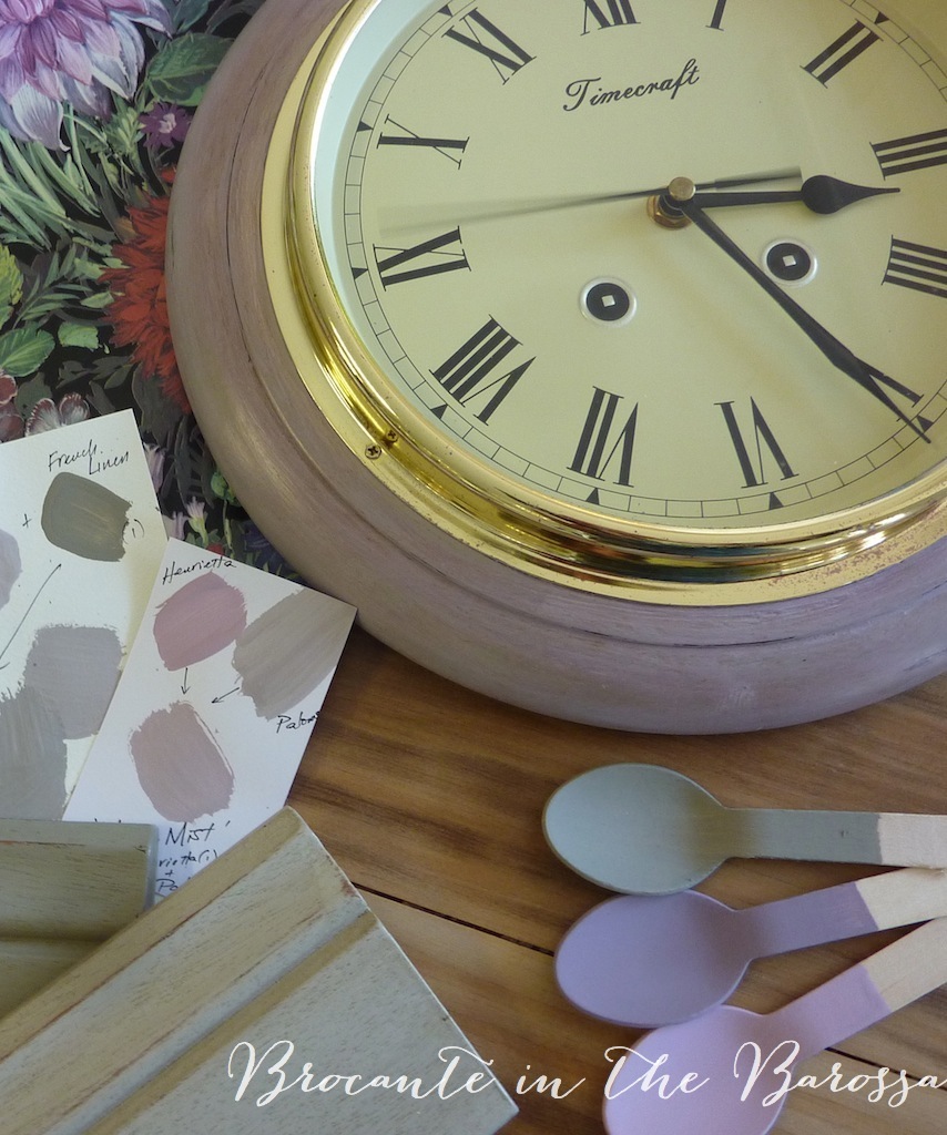
Other colour mixes I do on the surface I am painting.  This is a lot of fun, and I can be creative and also let the piece evolve.  The latest one I have done this way is a timber framed clock and I call its paintwork Heather Mists.   Mauve tones inspired by some mauve coloured tarnish patina on the gold tone frame.  Its paintwork is done layers of different purple and mauve colours, first Emile.  Then Paloma.  And into Paloma, I pushed in a bit of French Linen for soft subtlety.  And for a bit of elegant pizzazz, I used Henrietta on it too, before the Paloma paint layer was dry.  Henrietta sits the fence between mid tone purple and pink.  I thought it was too bright and sweet, but I am liking it when it is mixed in with friends :)  The clock frame got a clear wax, some distressing to expose the darker purple Emile layer and then a bit of dark wax to finish it.

More colour work to come.  and will work better on blog posts too !!


Sunday, March 31, 2013

Antique Easter Greeting

Antique Easter card, postmark dated 1911 
I have been collecting old post cards for a few years now, mostly choosing ones that have old postmarks and cute visuals or messages.  This is one of my favourites and it is more than vintage, it's a bonafide antique, being over 100 years old ! A sweet Easter card, with pretty spring landscape, an Easter Lily and such a cute Easter chick.  I love the typography on this card too, a beautiful lettering for the message.

Wishing all a happy peaceful Easter.  Nearly over here in Australia, just starting in USA.  Europe half way through !