
 |
| Our latest window display ! |
 |
| Bison ceramics, made and designed in Australia |
 |
| Antoinette Damask stencil pattern, by Royal Design Studio. in Coco Chalk Paint. |
 |
| Annie Sloan Chalk Paint colour chart |
I have worked on a lot of colour mixing. First, hand painted colour charts. Actually, Ian is the designer of the process by which we build them...which is time-consuming. The swatches are hand painted onto labels and then he lifts them on and places each onto the printed colour chart card using a precision cut template (that he made), so they are aligned perfectly straight and exactly in place above the colour names. And of course, the charts are beautiful.
 I work on colour mixes and colour recipes for them. Sometimes on swatches, and sometimes for customers. Other times just what I feel like painting up. Or experimenting. I make up colour recipes and mixing onto 300 gsm watercolour papers, which I cut into strips with a small paper cutter. I have made some nice ones. If the colour is nice and as a mixed colour hasn't already been dubbed by someone else, I may give it my own name. Like Driftwood Grey, made up of French Linen and Paris Grey. Now I need to name this mix of Coco and Graphite (just above).
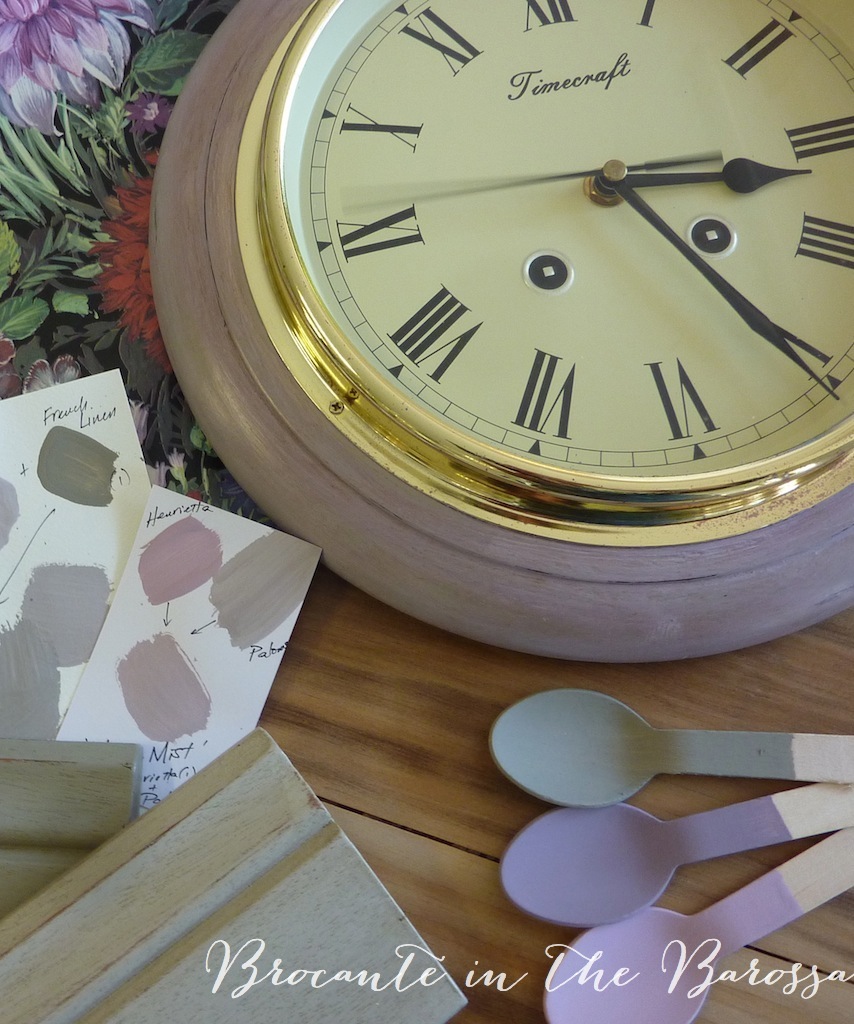 Other colour mixes I do on the surface I am painting. This is a lot of fun, and I can be creative and also let the piece evolve. The latest one I have done this way is a timber framed clock and I call its paintwork Heather Mists. Mauve tones inspired by some mauve coloured tarnish patina on the gold tone frame. Its paintwork is done layers of different purple and mauve colours, first Emile. Then Paloma. And into Paloma, I pushed in a bit of French Linen for soft subtlety. And for a bit of elegant pizzazz, I used Henrietta on it too, before the Paloma paint layer was dry. Henrietta sits the fence between mid tone purple and pink. I thought it was too bright and sweet, but I am liking it when it is mixed in with friends :) The clock frame got a clear wax, some distressing to expose the darker purple Emile layer and then a bit of dark wax to finish it.
  More colour work to come. and will work better on blog posts too !!


 Posts
Posts


